A new Australian fashion label was building from scratch. The brief was clear: create a distinctive visual identity that could carry across products, web, and content — without looking generic or templated. The brand needed an illustration system that felt signature and versatile, and a cohesive rollout plan that would support a confident launch.
The Challenge: Starting from zero with a distinctive point of view.
The label had a strong creative vision — sustainable, joyful, ethically made fashion with a sense of history and irreverence. What it didn't have was a visual system to carry that vision consistently across formats. Without one, every piece of content would start from scratch, every product page would look different, and the brand would never build the recognition it needed to grow.
The visual identity needed to work across blog illustrations, product pages, social content, packaging, and web — and it needed to feel immediately recognisable as belonging to this brand and no other.











What Was Built: The System
The engagement produced three interconnected layers of visual identity.
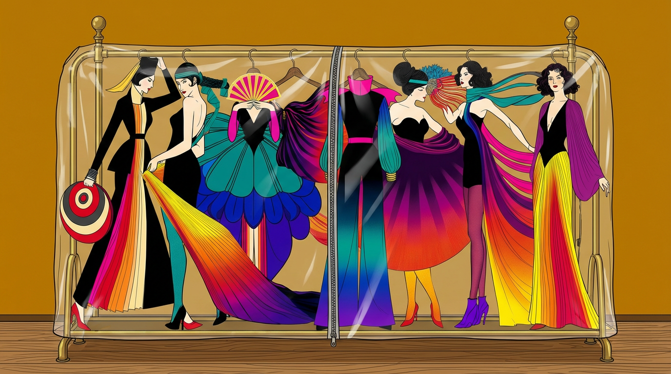
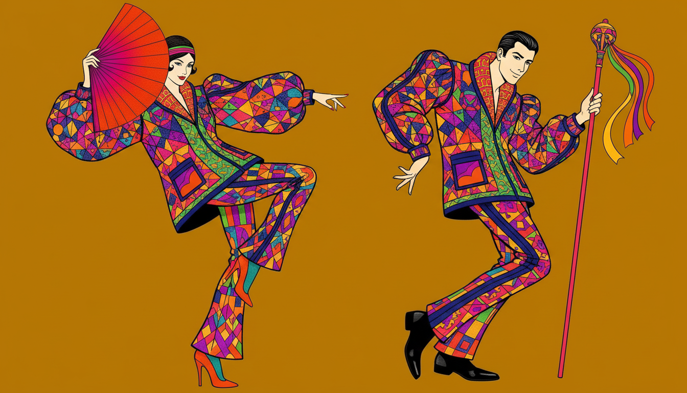
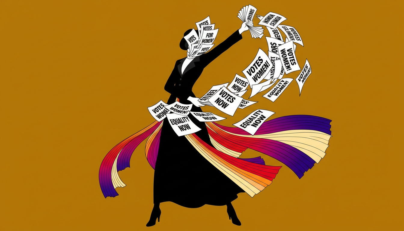
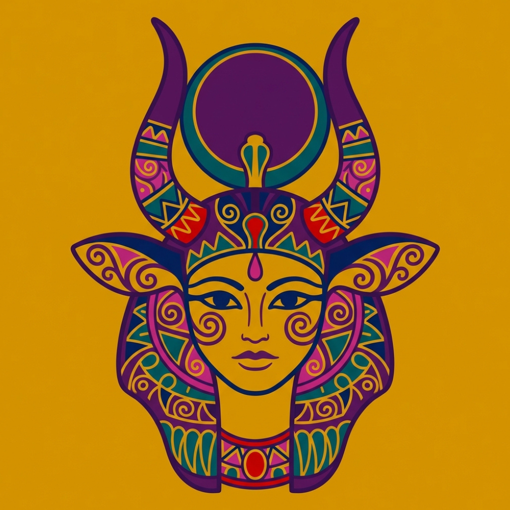
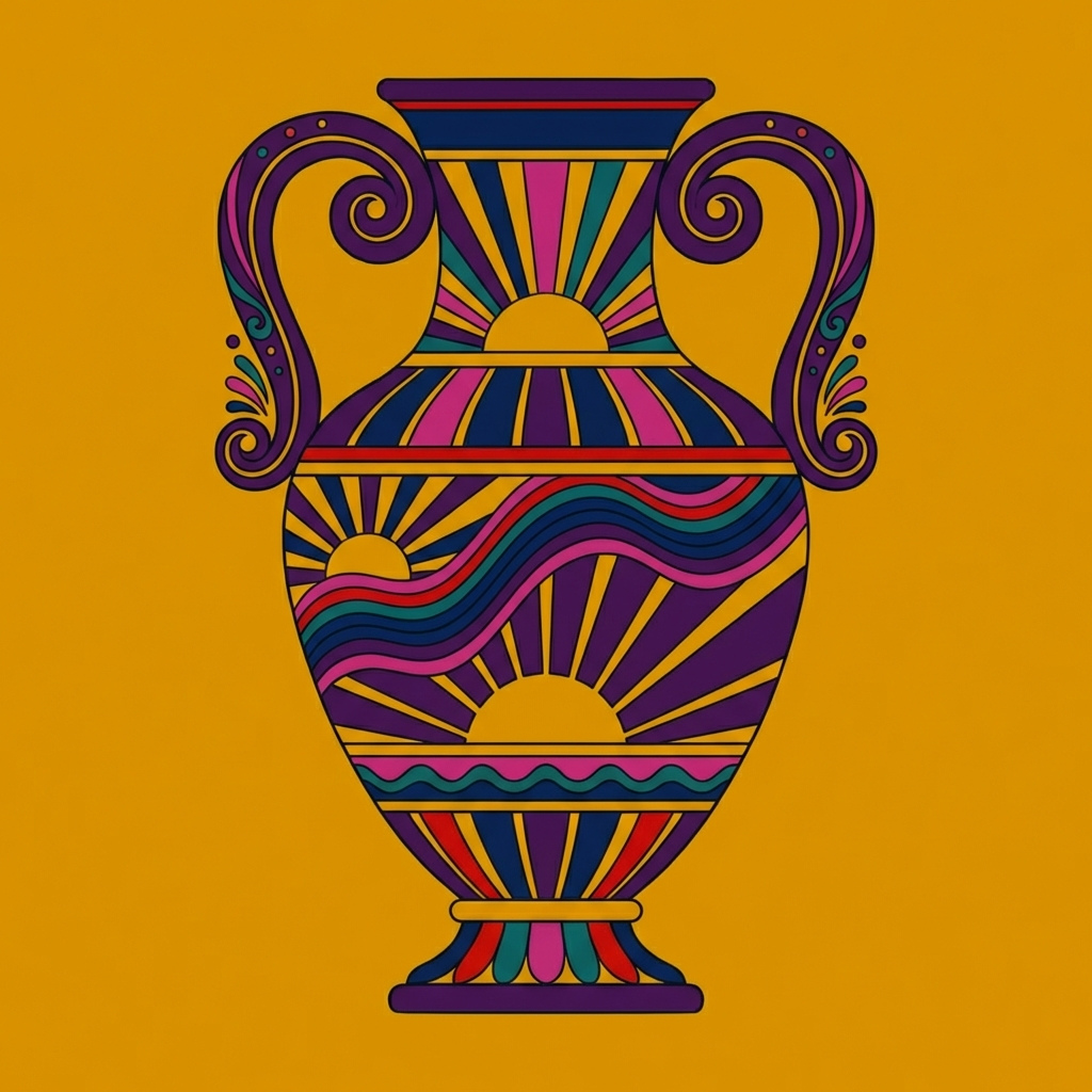
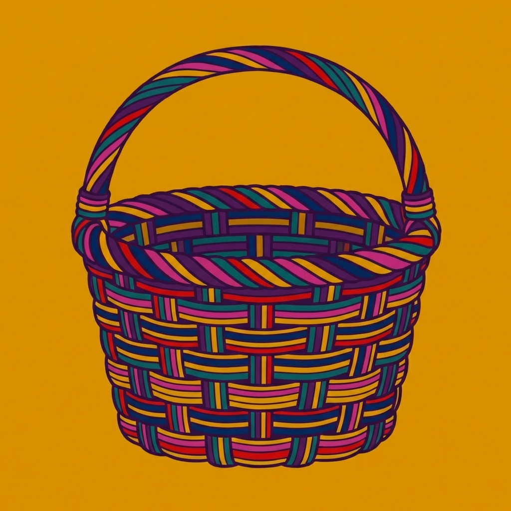
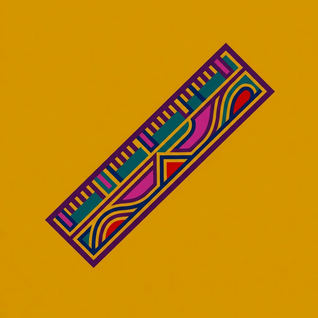
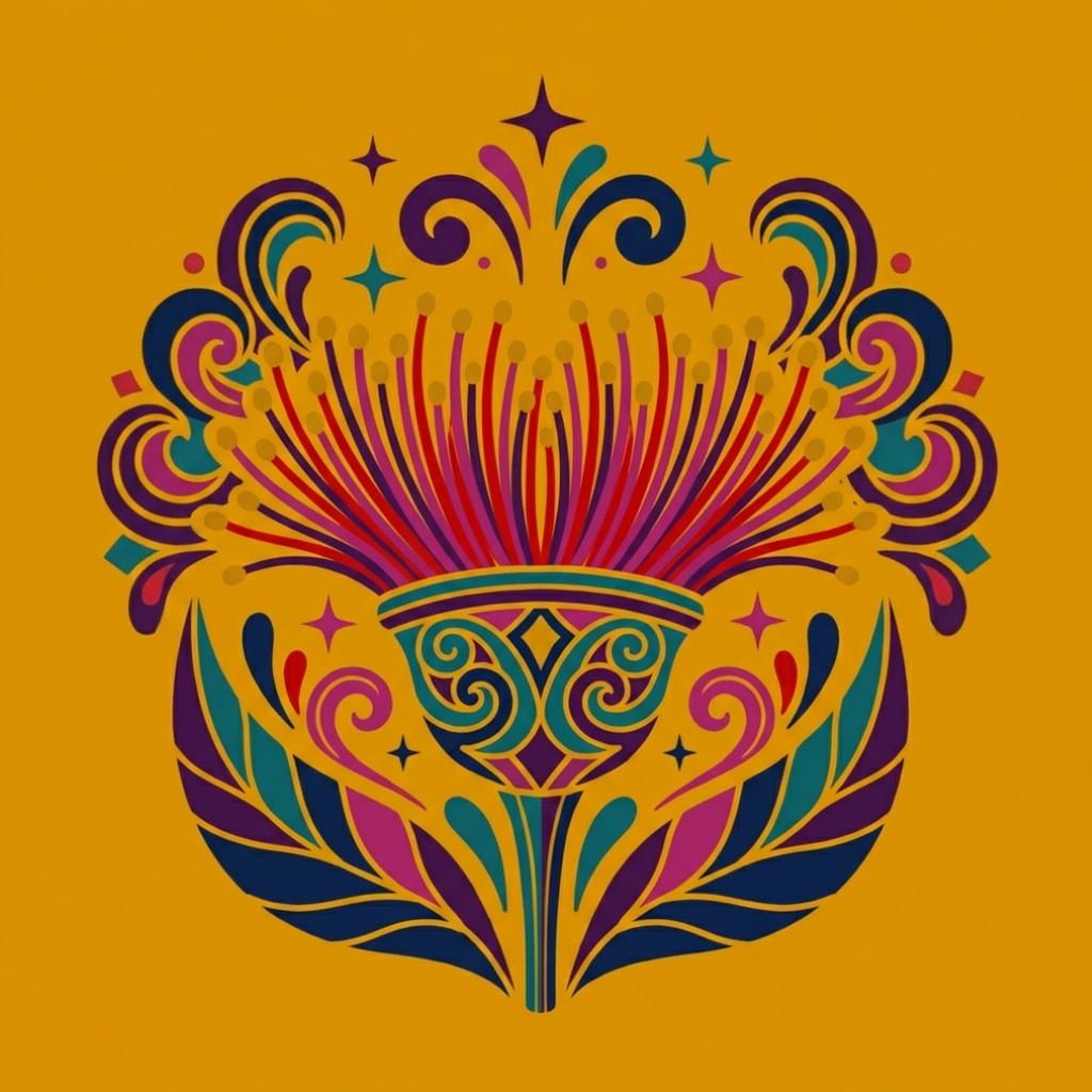
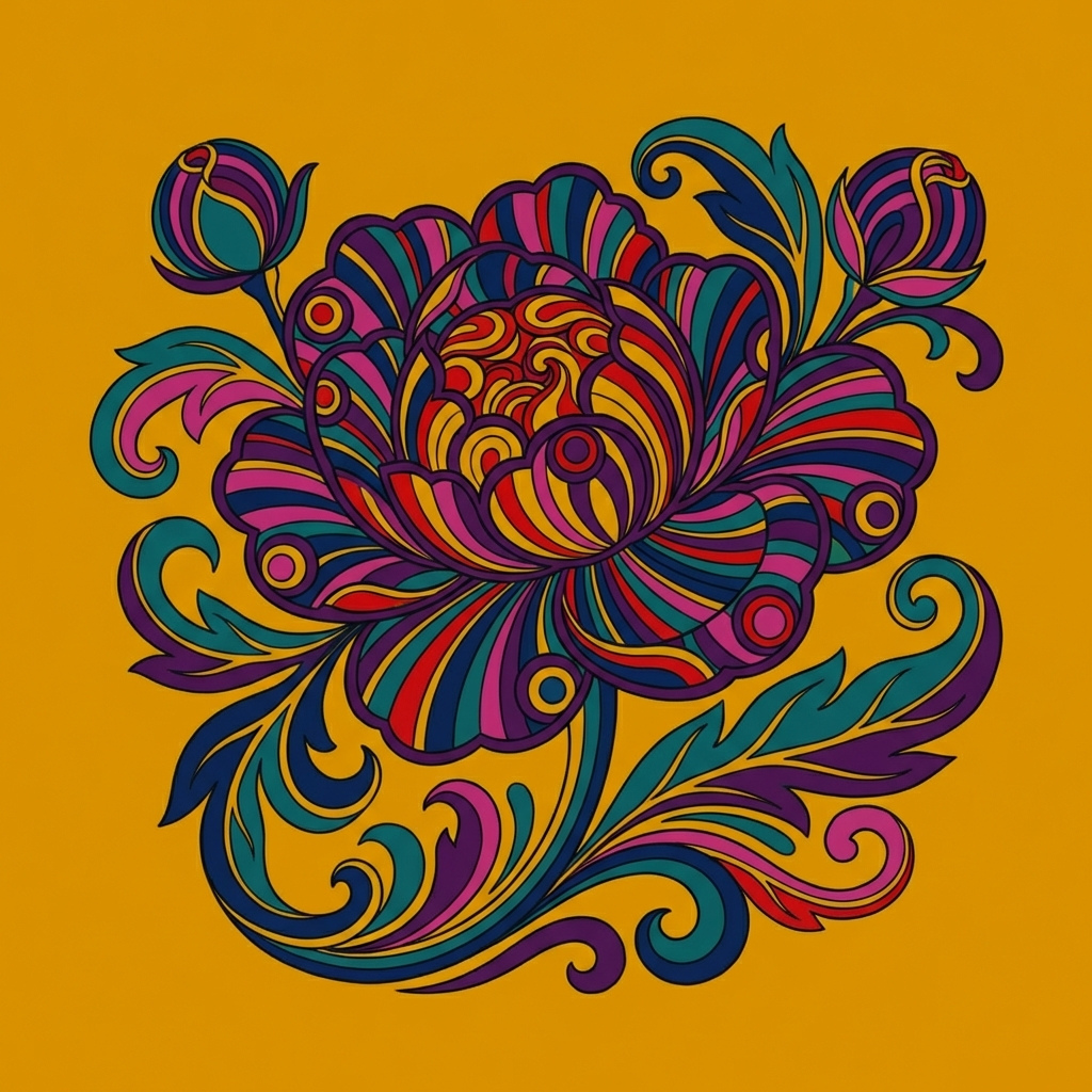
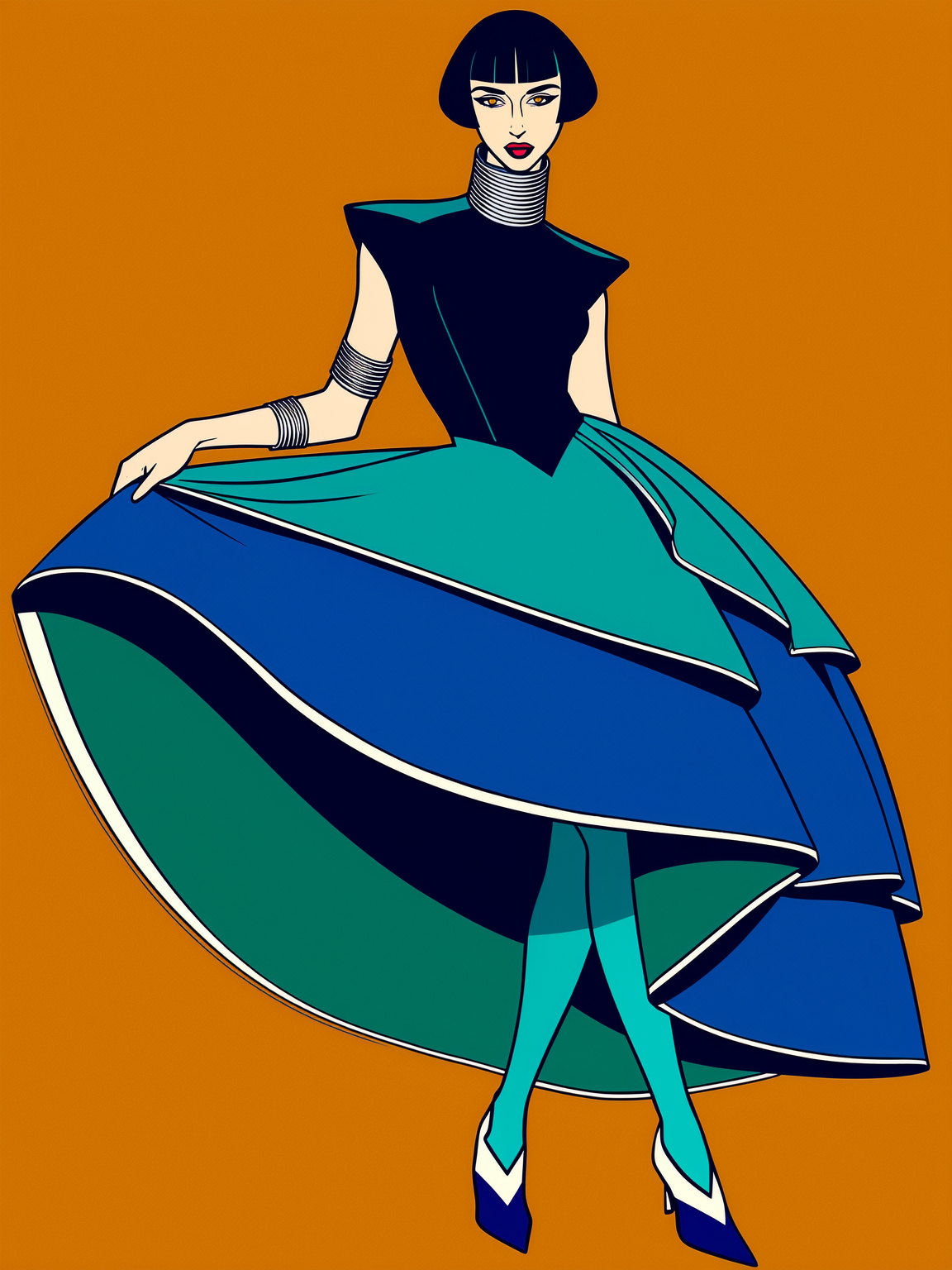
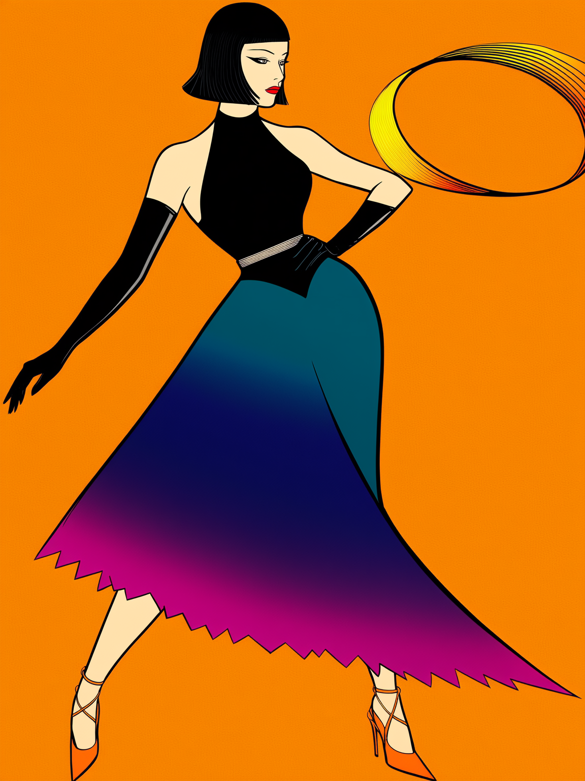
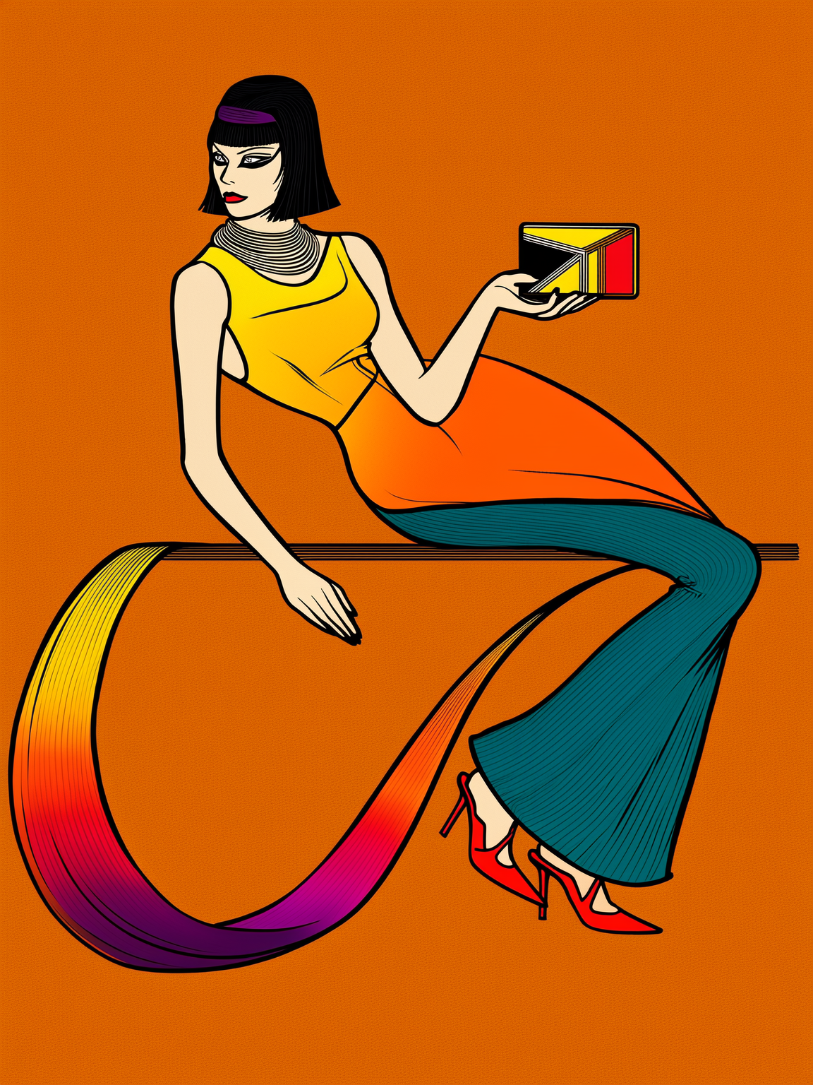
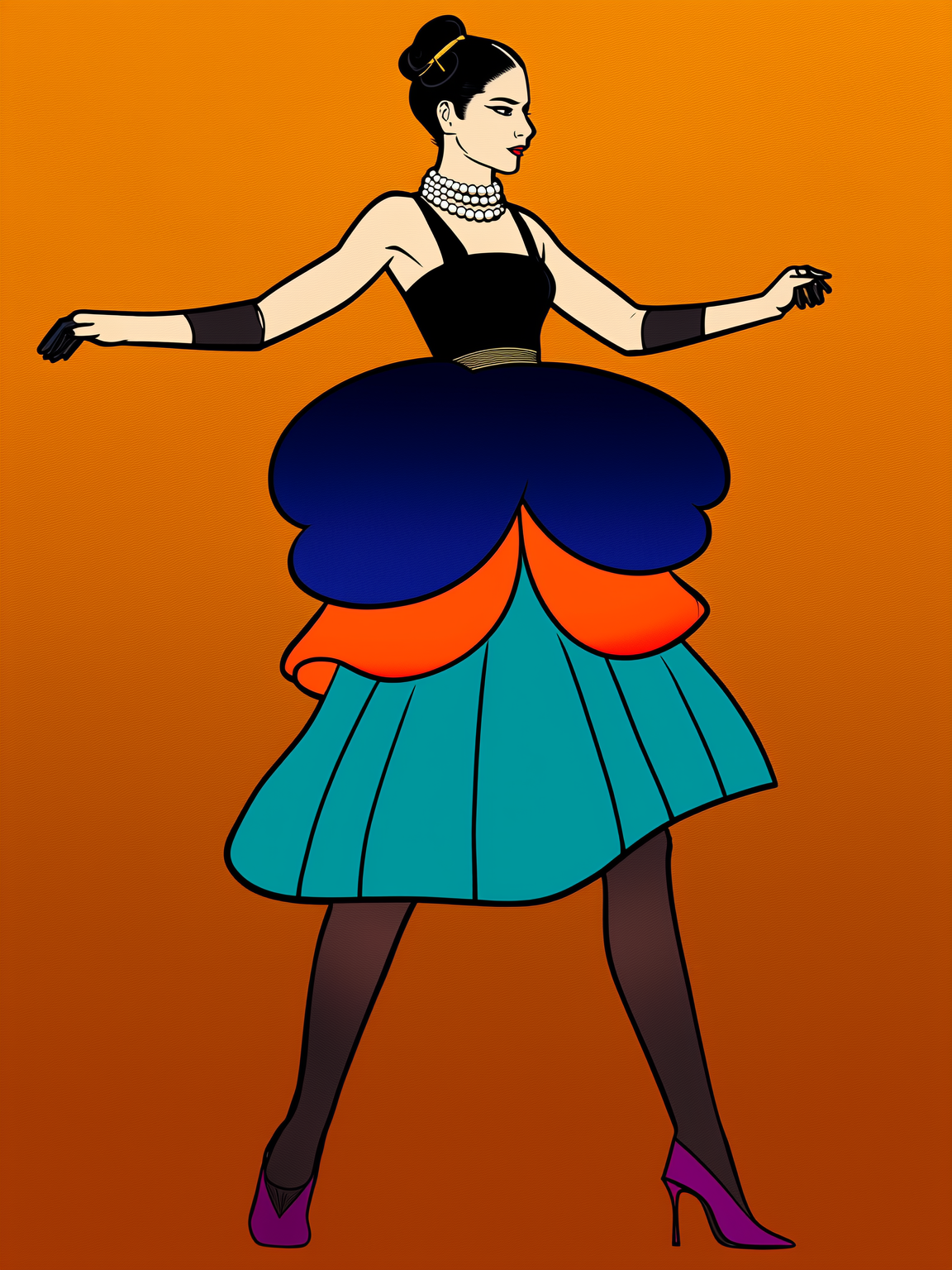
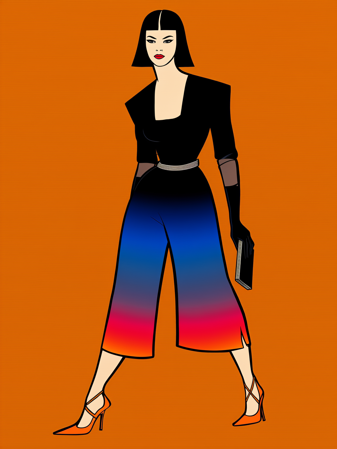
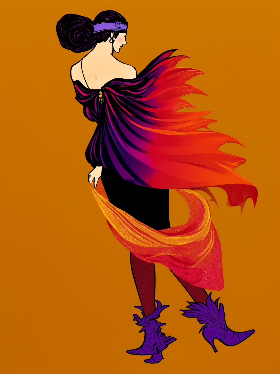
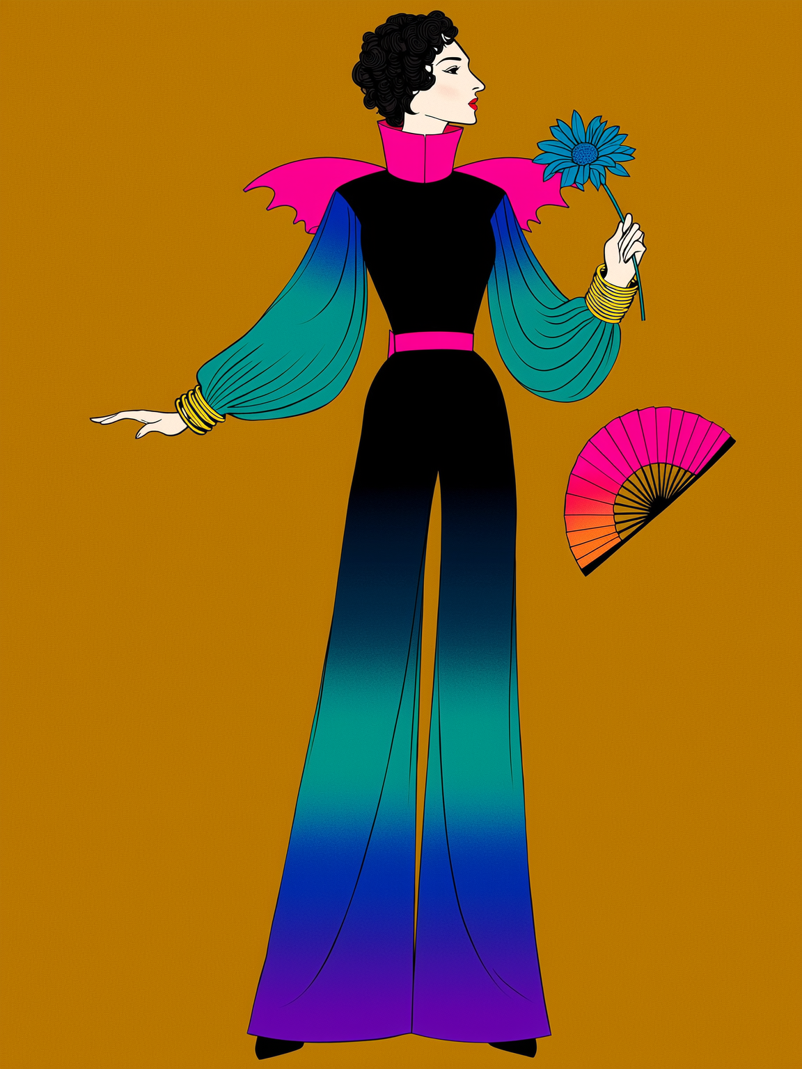
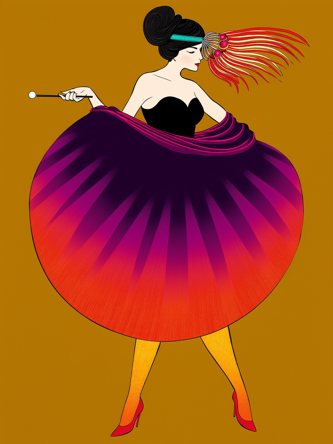
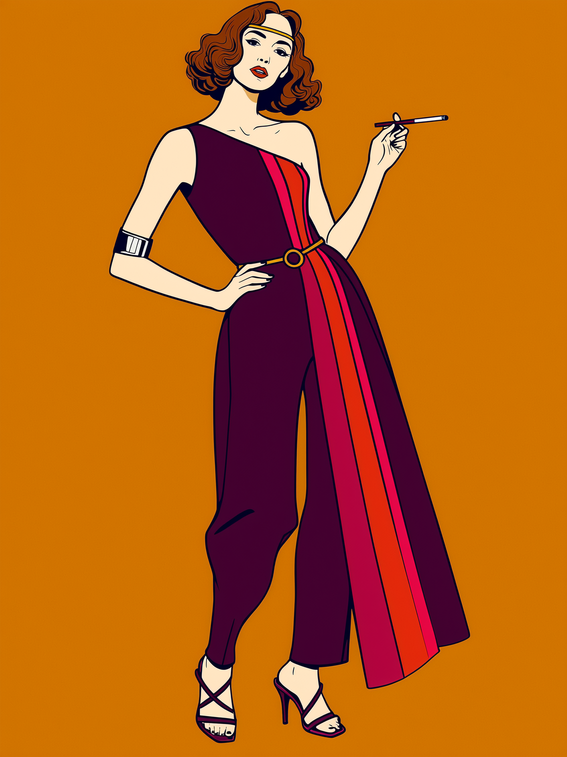
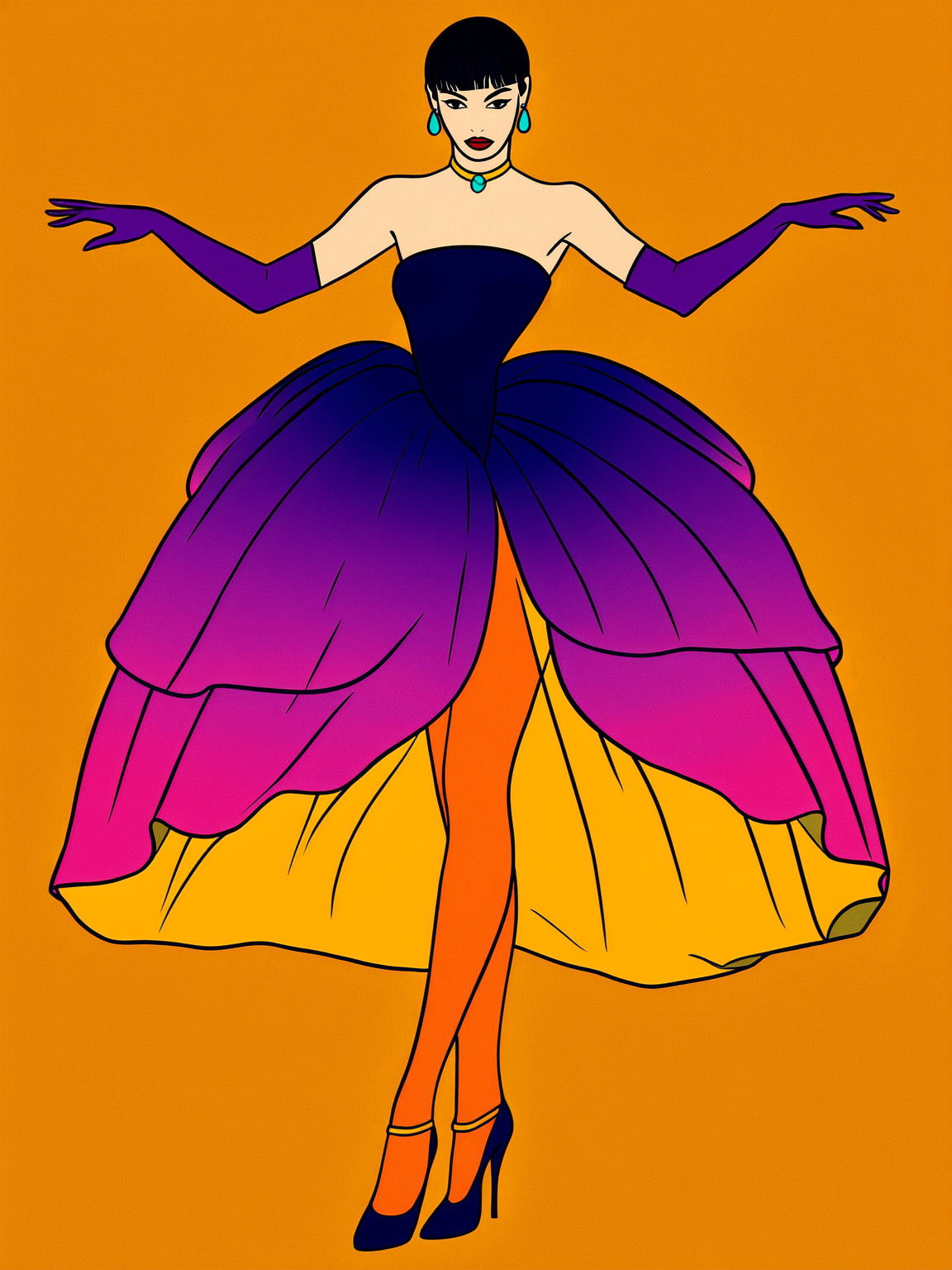
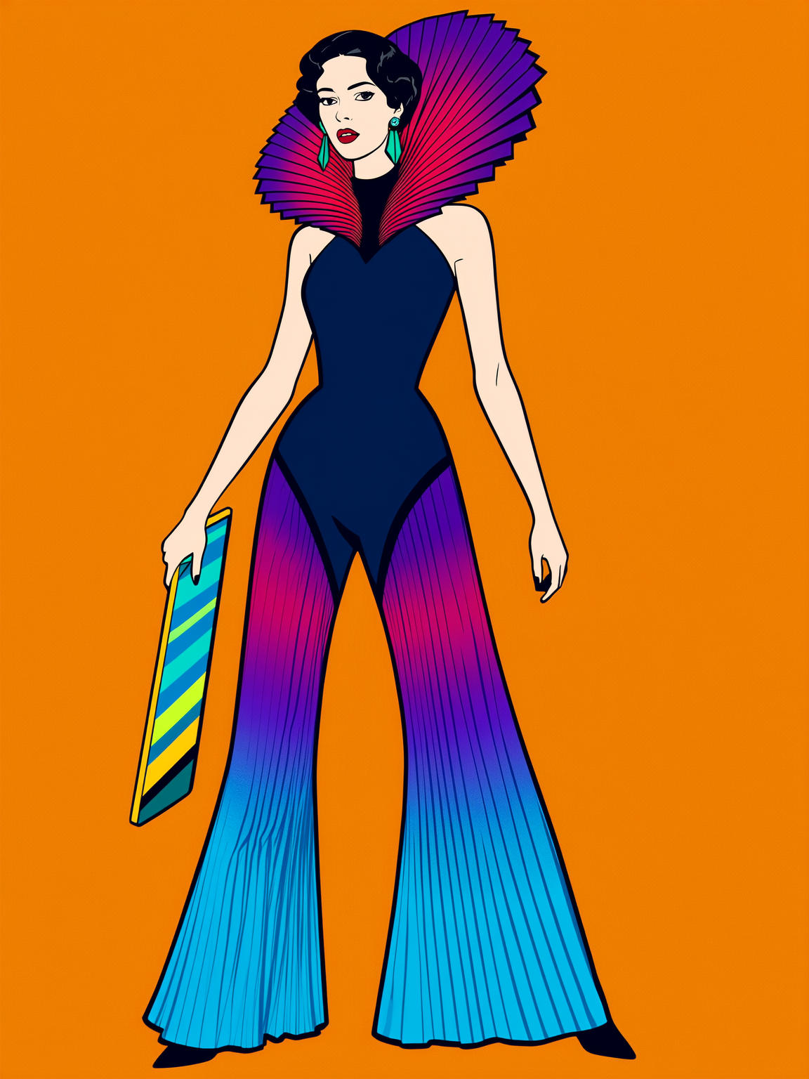
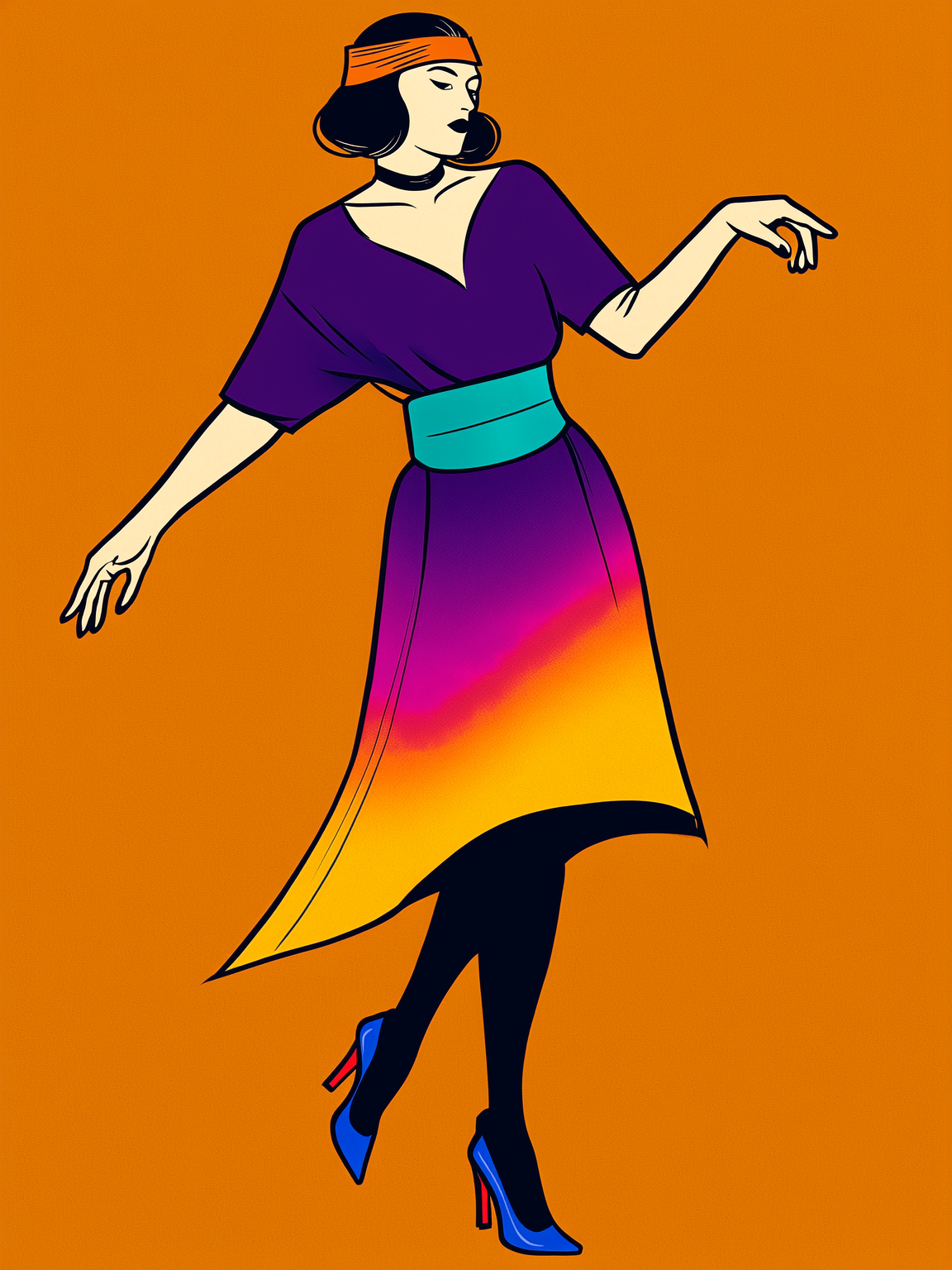
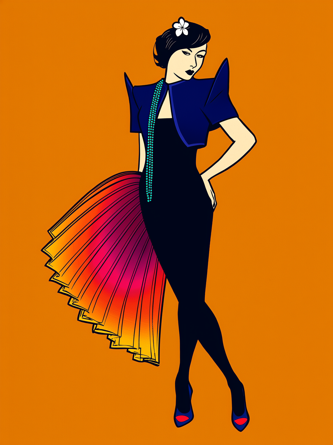
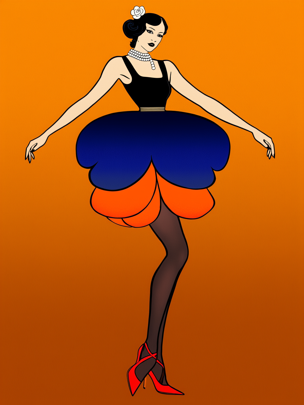
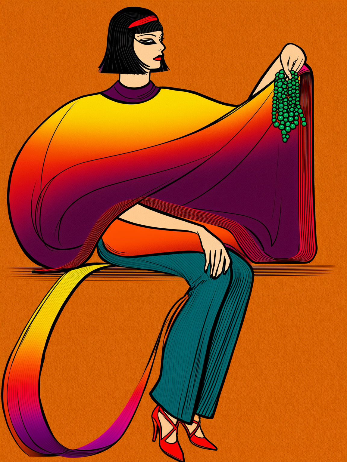
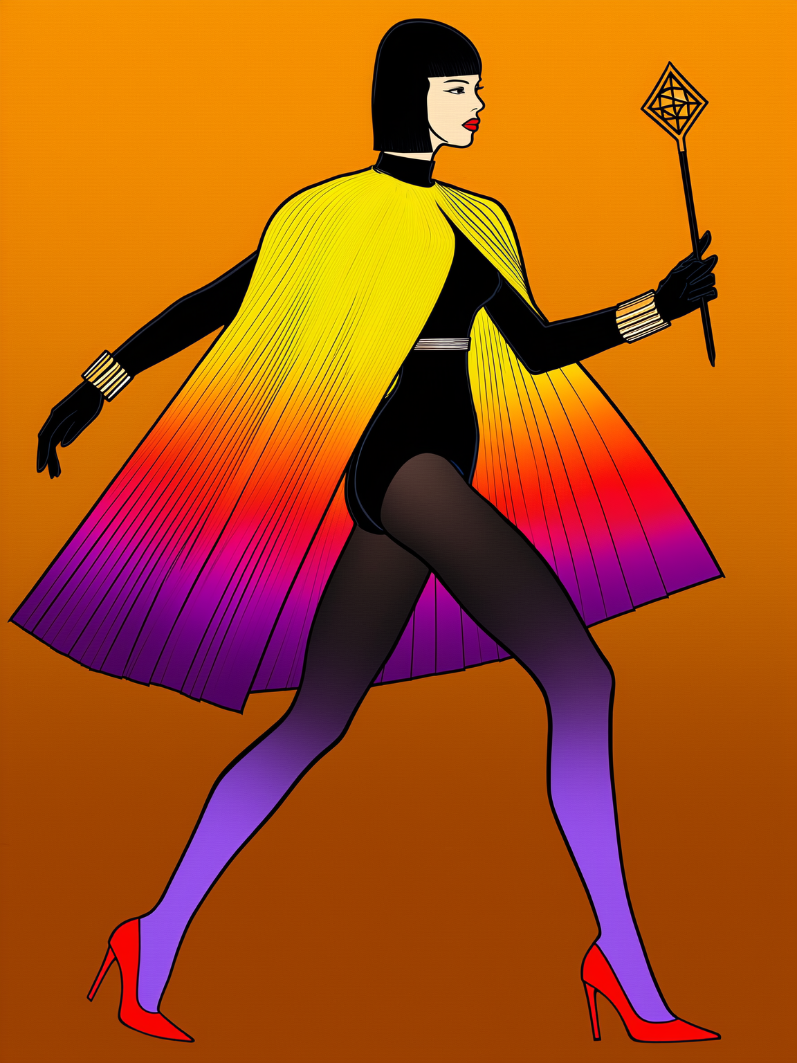
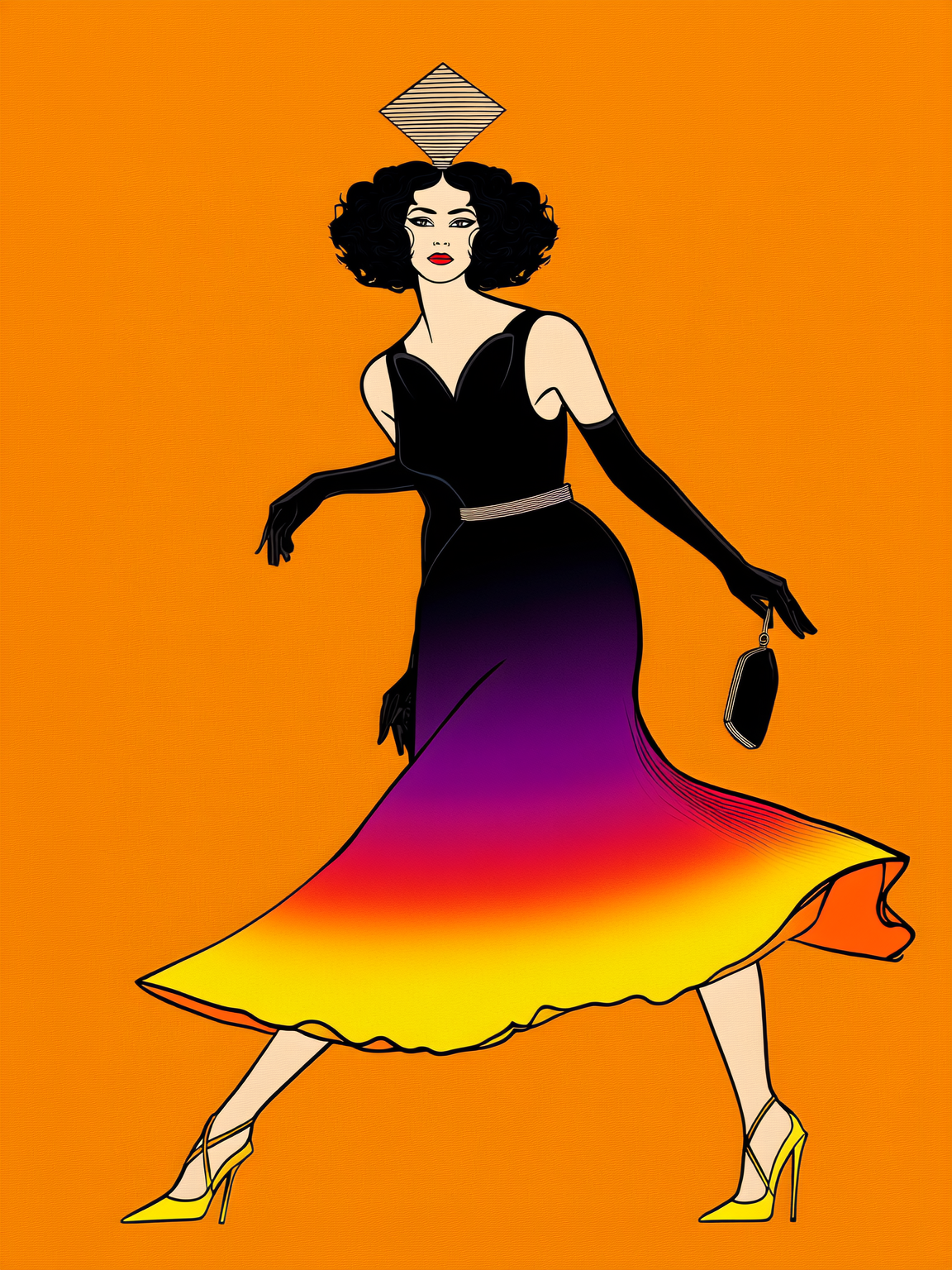
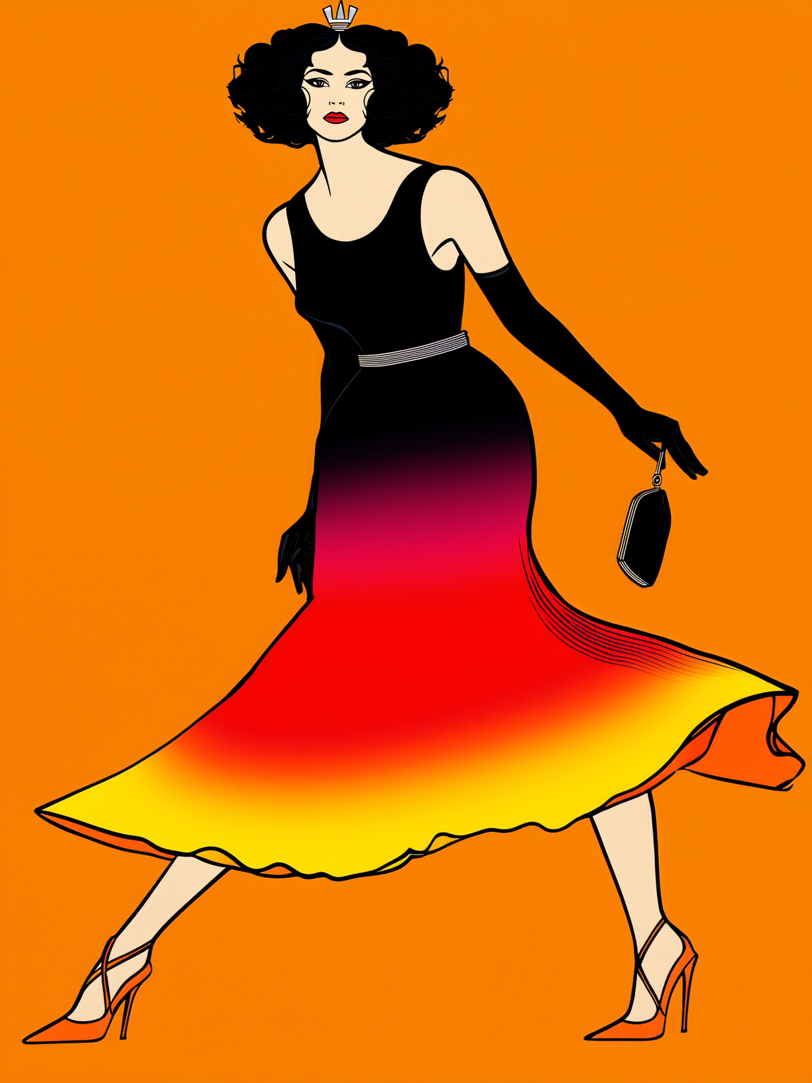
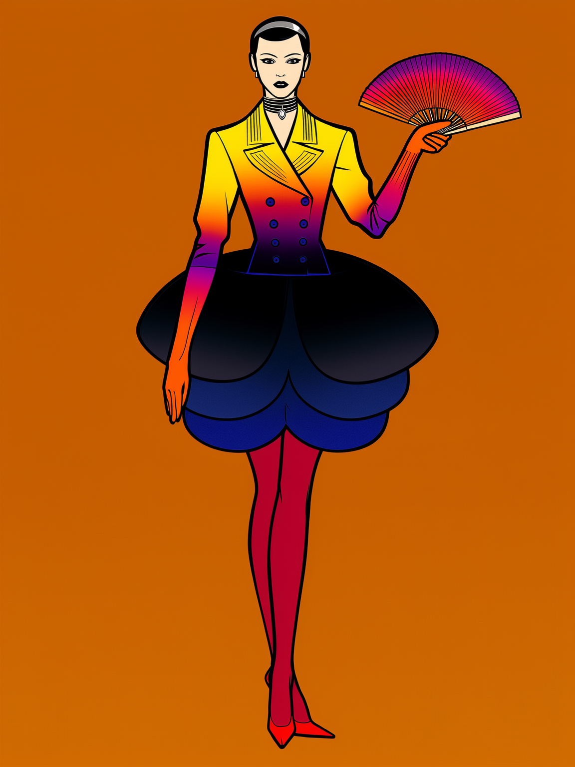
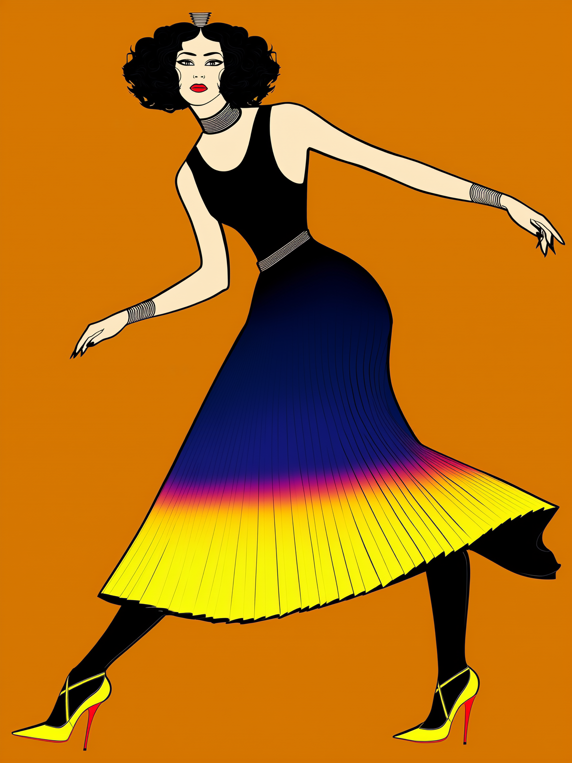
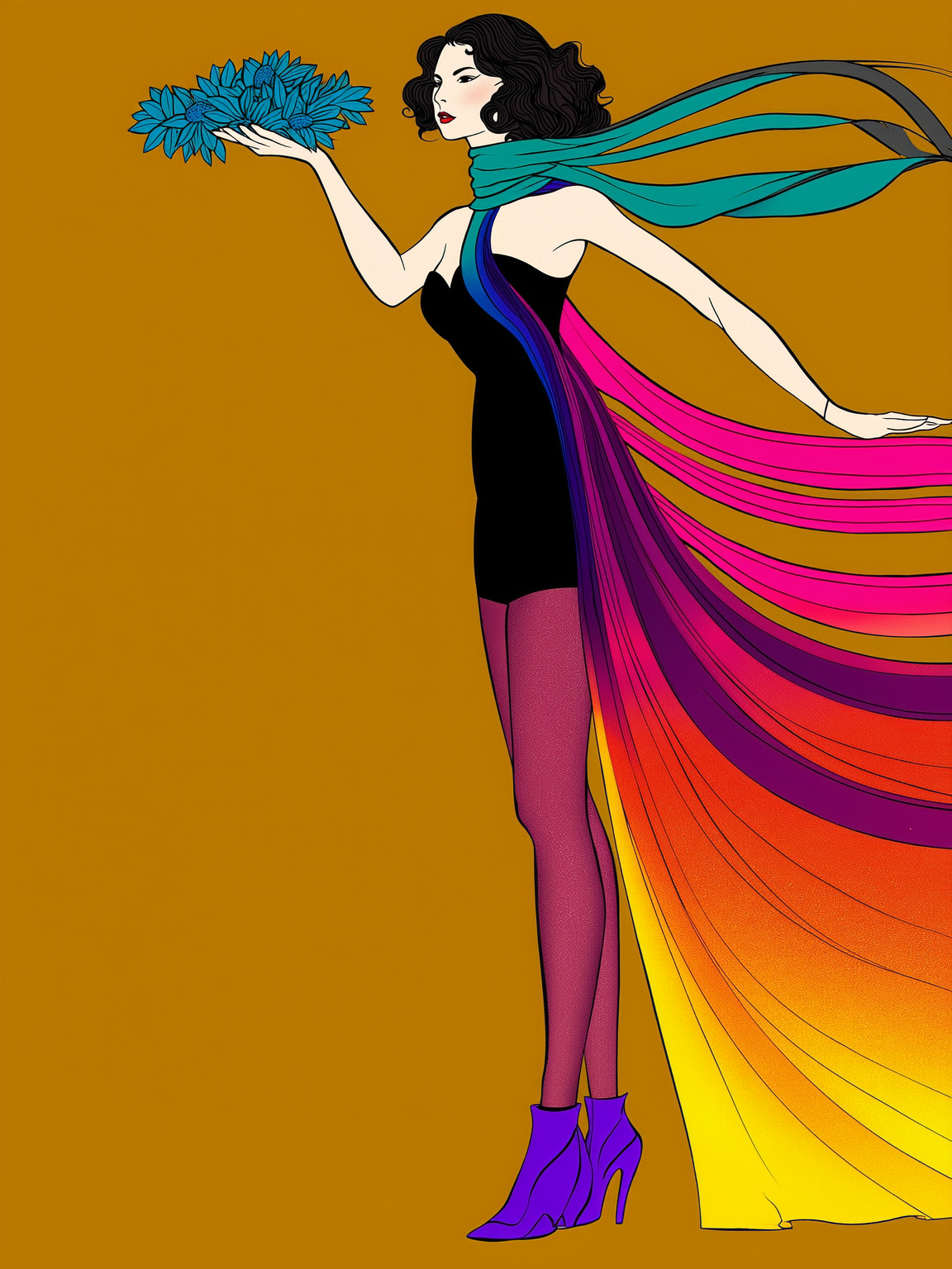
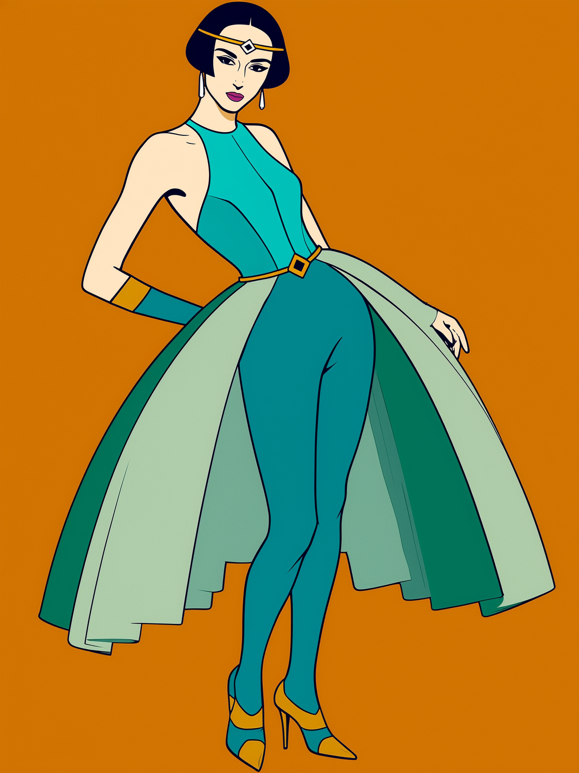
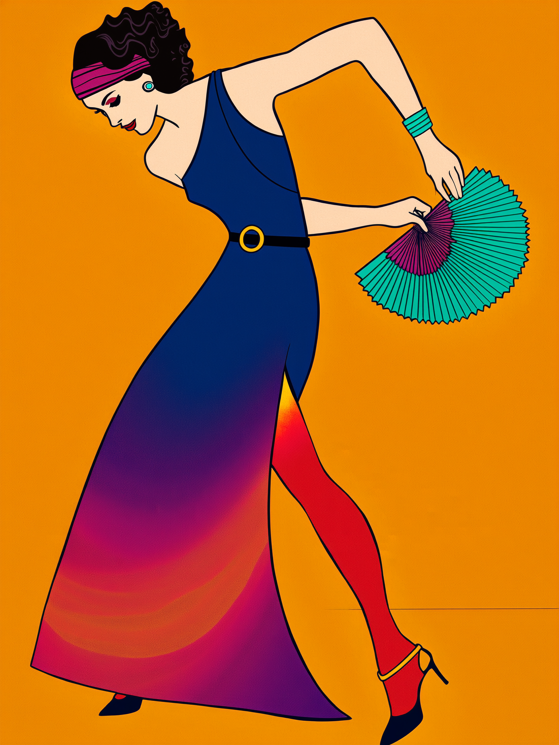
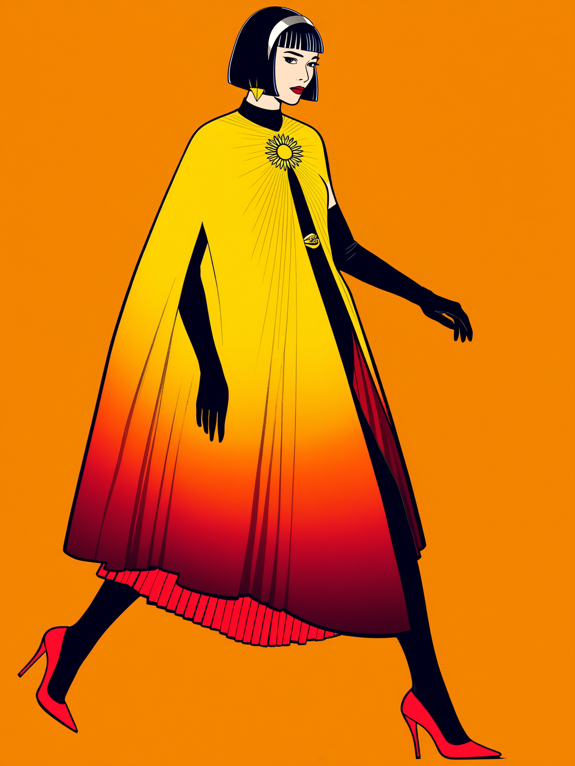
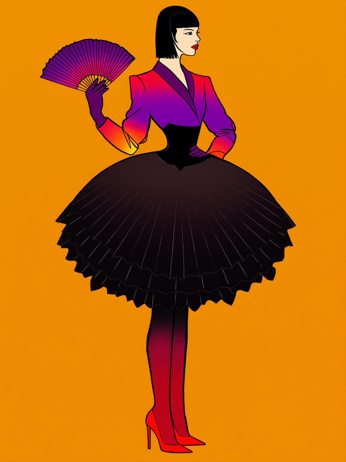
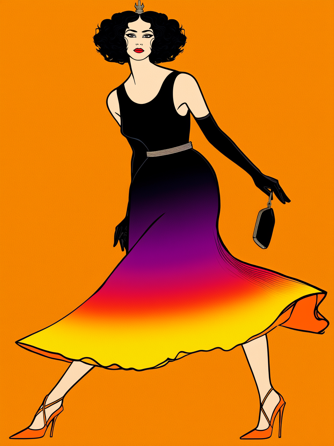
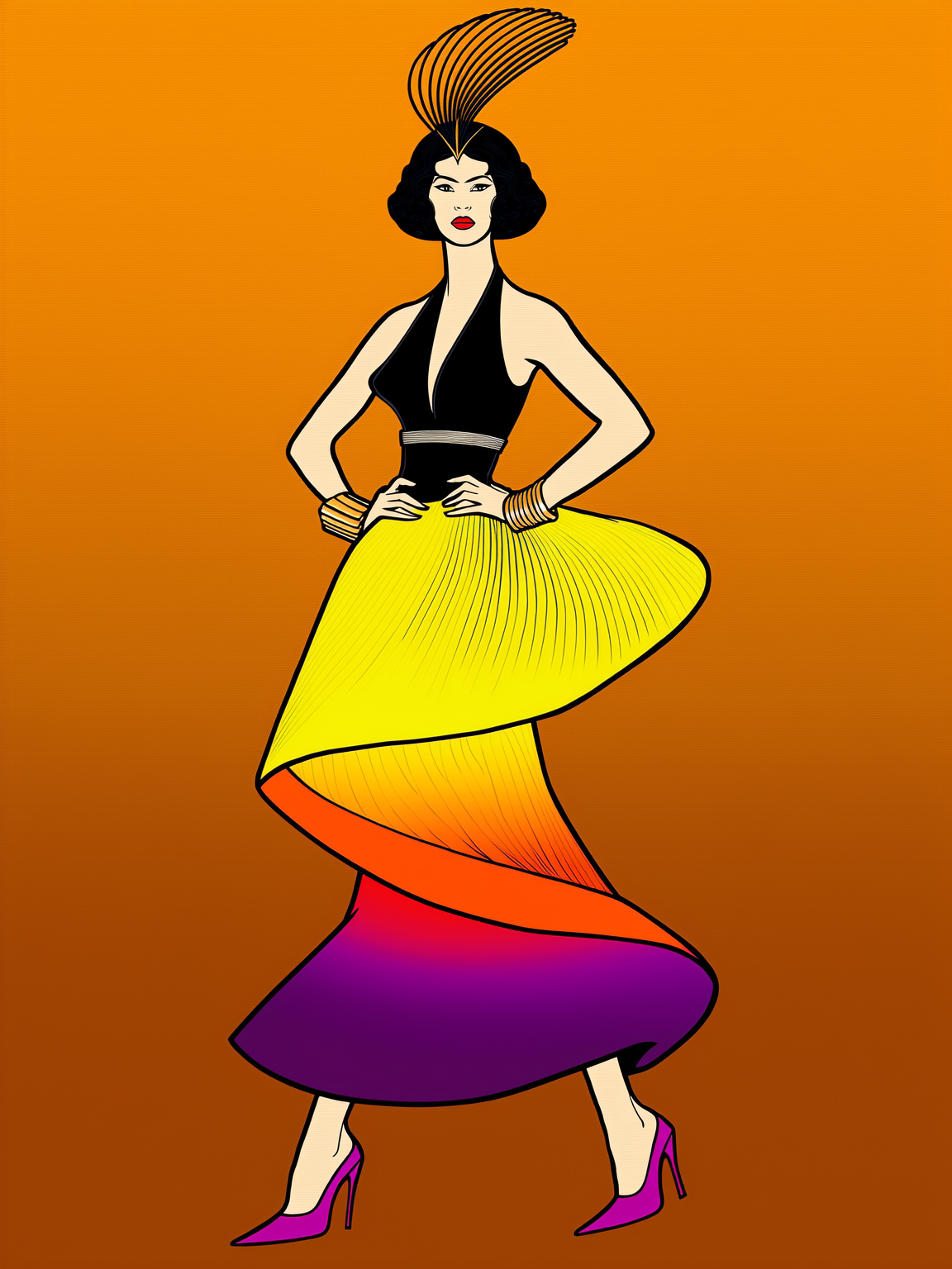
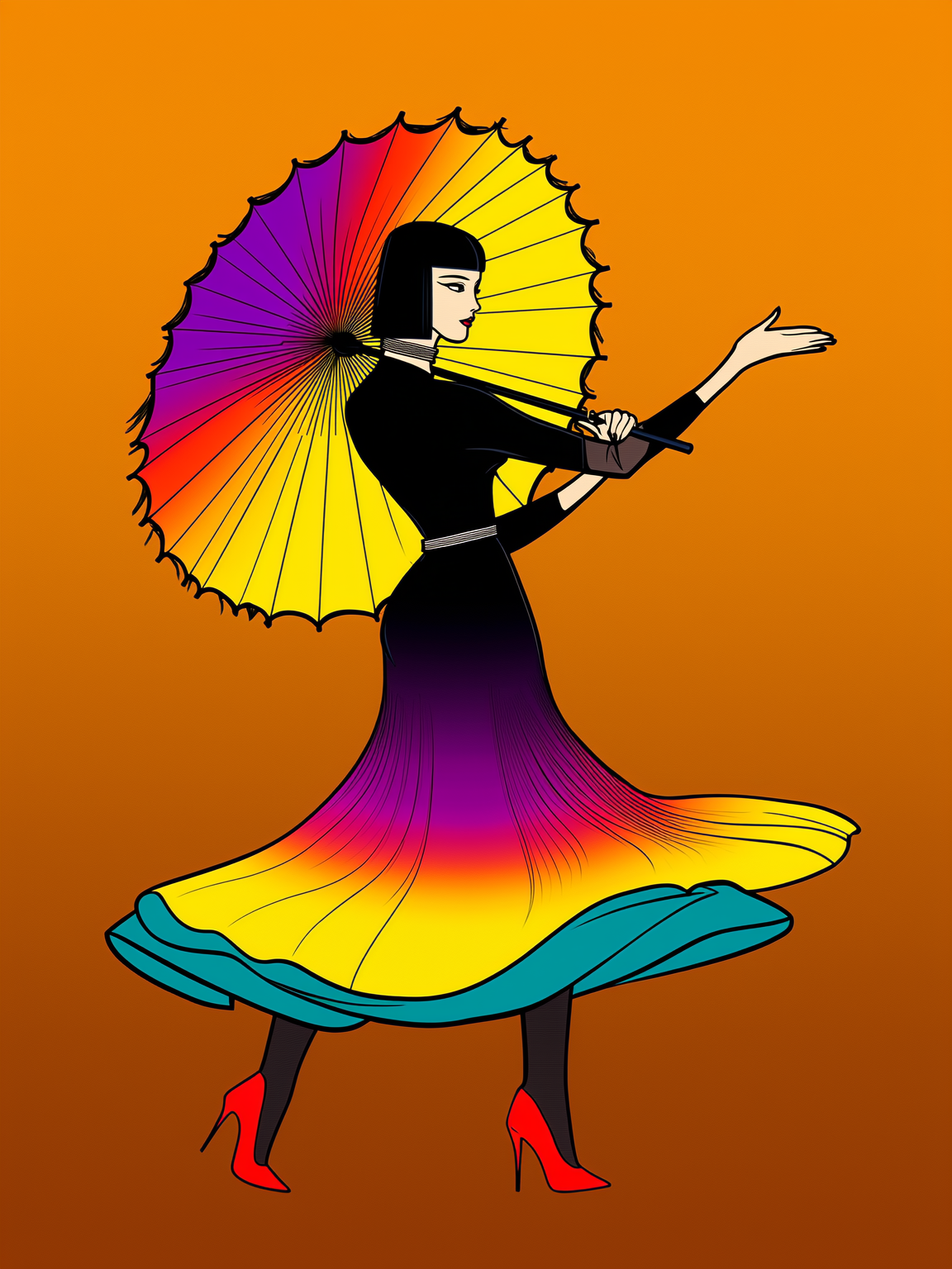
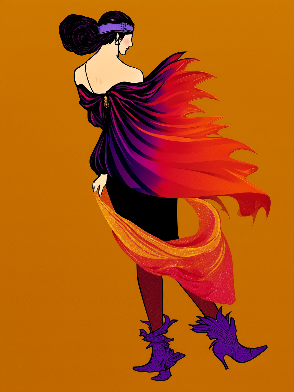
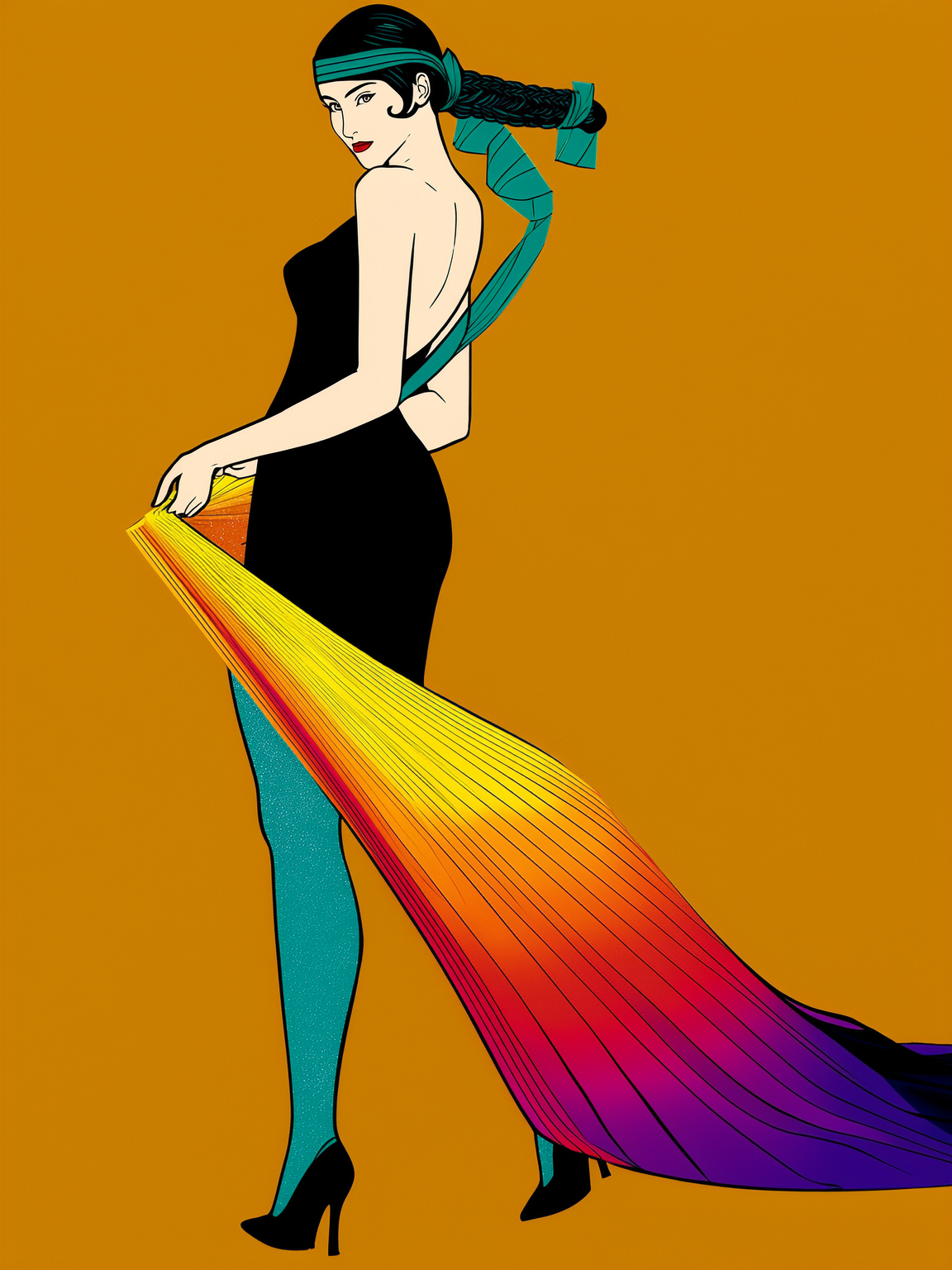
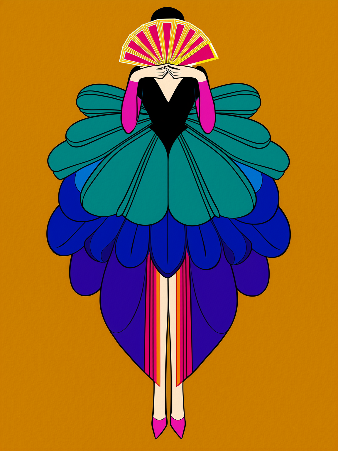
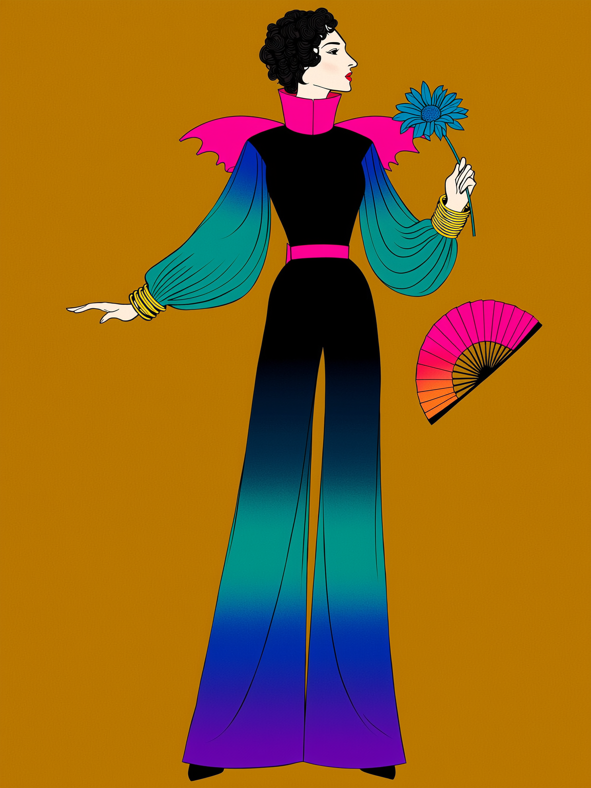
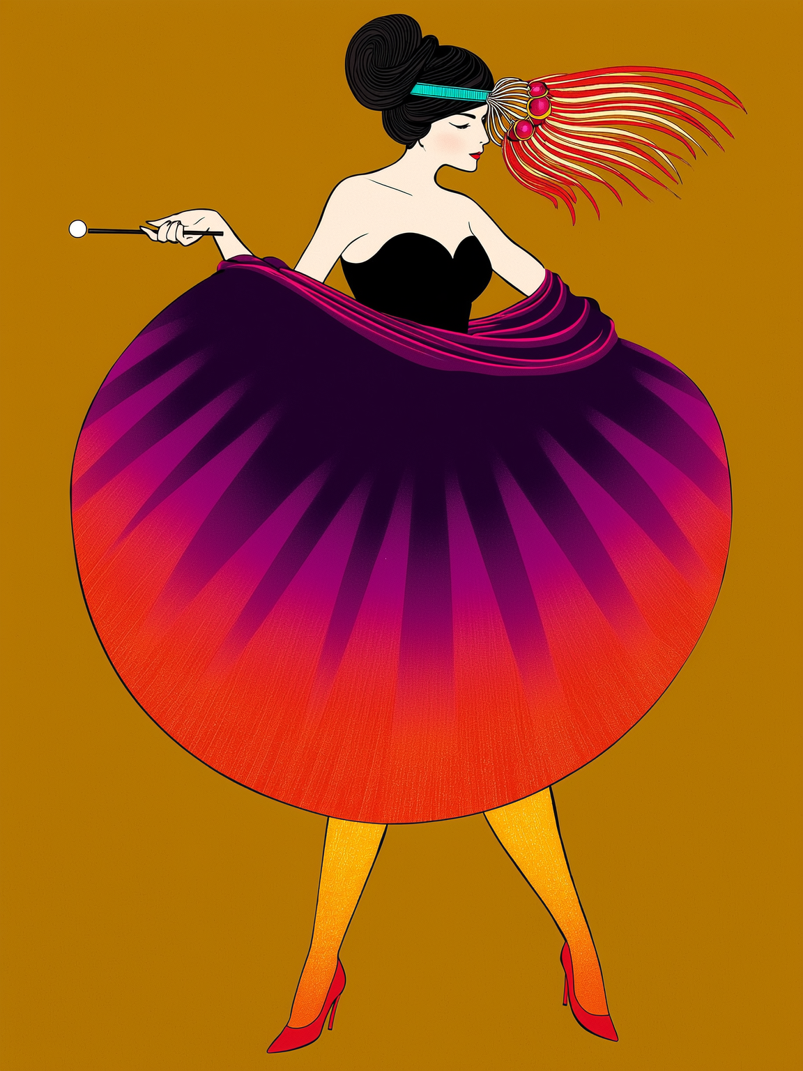
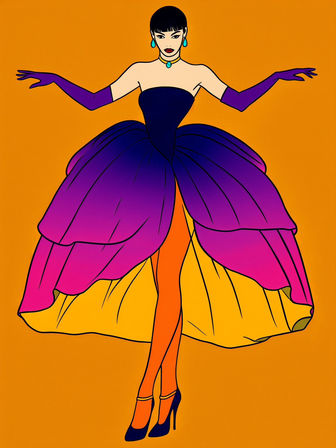
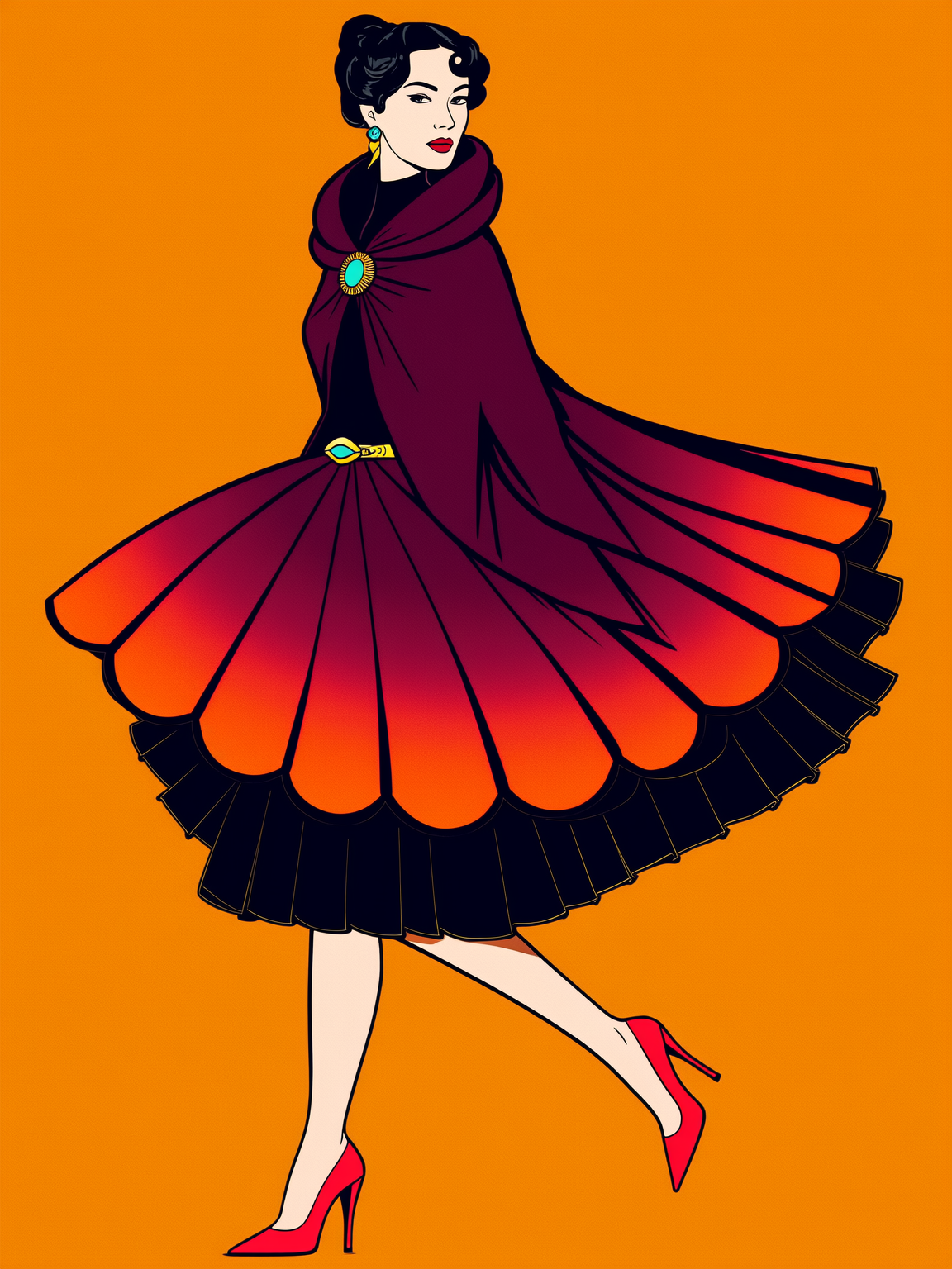
The first layer is an illustration system built around two distinct but complementary modes. The fashion figure illustrations — bold, art deco-influenced characters in dynamic poses — carry the brand's personality across editorial content, blog posts, and social. The decorative object and motif system — ornate scissors, thread spools, mythological figures, intricate botanicals — provides a rich supporting visual language for product pages, packaging, and pattern work.
The second layer is the colour and background system. Every illustration sits on the same amber/gold background with a consistent palette of deep navy, teal, magenta, violet, and red outlined in gold. The result is immediate visual coherence — any piece of content is recognisably part of the same world.
The third layer is the content pipeline. The illustration system was designed to be generative — new figures, objects, and motifs can be produced to brief, maintaining consistency without requiring the brand to start from scratch for every new piece of content.





















Outcomes: What was produced
— A logo design and distinctive illustration system ready to become the brand's signature visual language
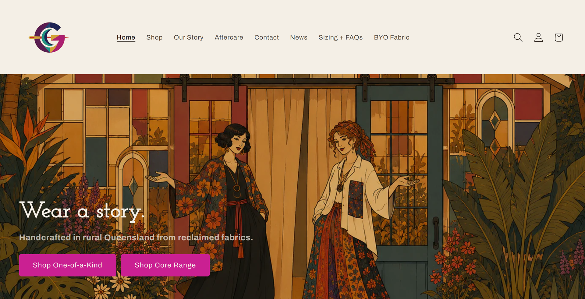
— Launch-ready assets reusable across web, product pages, packaging, and social, including a Shopify website
— A content pipeline that supports ongoing output without constant re-creation: AI brand writing assistants, social templates and content strategy
— A brand that looks like it has been building for years before it has sold a single piece
— Launch-ready assets reusable across web, product pages, packaging, and social, including a Shopify website
— A content pipeline that supports ongoing output without constant re-creation: AI brand writing assistants, social templates and content strategy
— A brand that looks like it has been building for years before it has sold a single piece